Are you baffled about how to choose the perfect colors for macrame patterns? Don’t fret! This article is here to lend a helping hand. Whether you’re a newbie or a seasoned macrame enthusiast, selecting the right colors for your designs can make a world of difference. From considering the mood and style you want to convey to understanding color theory, we’ve got you covered on all the tips and tricks that will make your macrame creations visually stunning. So, let’s dive in and discover the art of choosing colors for your macrame patterns!
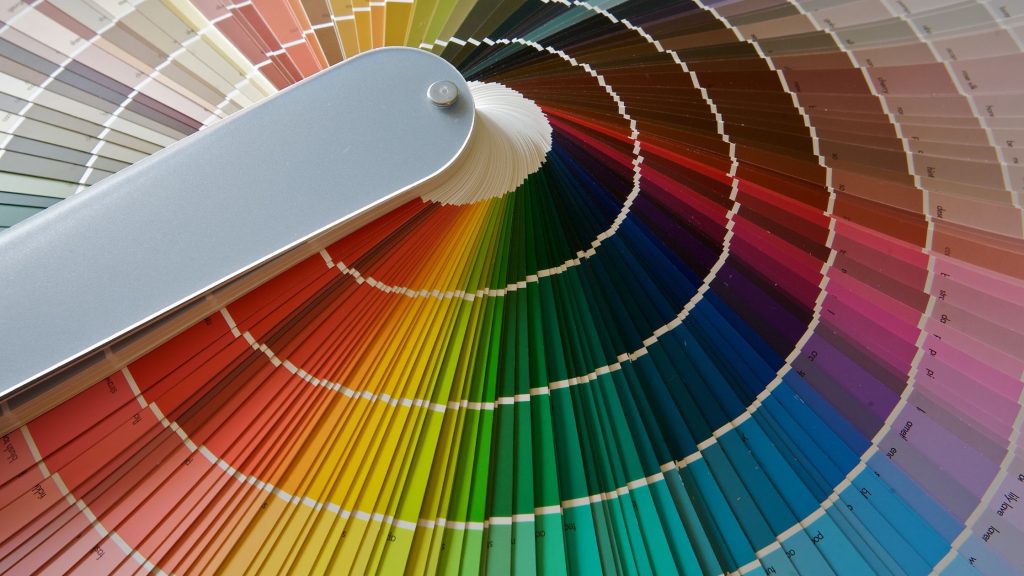
Understanding the Color Wheel
Primary Colors
When it comes to understanding the color wheel, it’s important to start with the basics. The primary colors are red, blue, and yellow. These colors are considered the building blocks of all other colors on the wheel. They cannot be created by mixing other colors together.
Secondary Colors
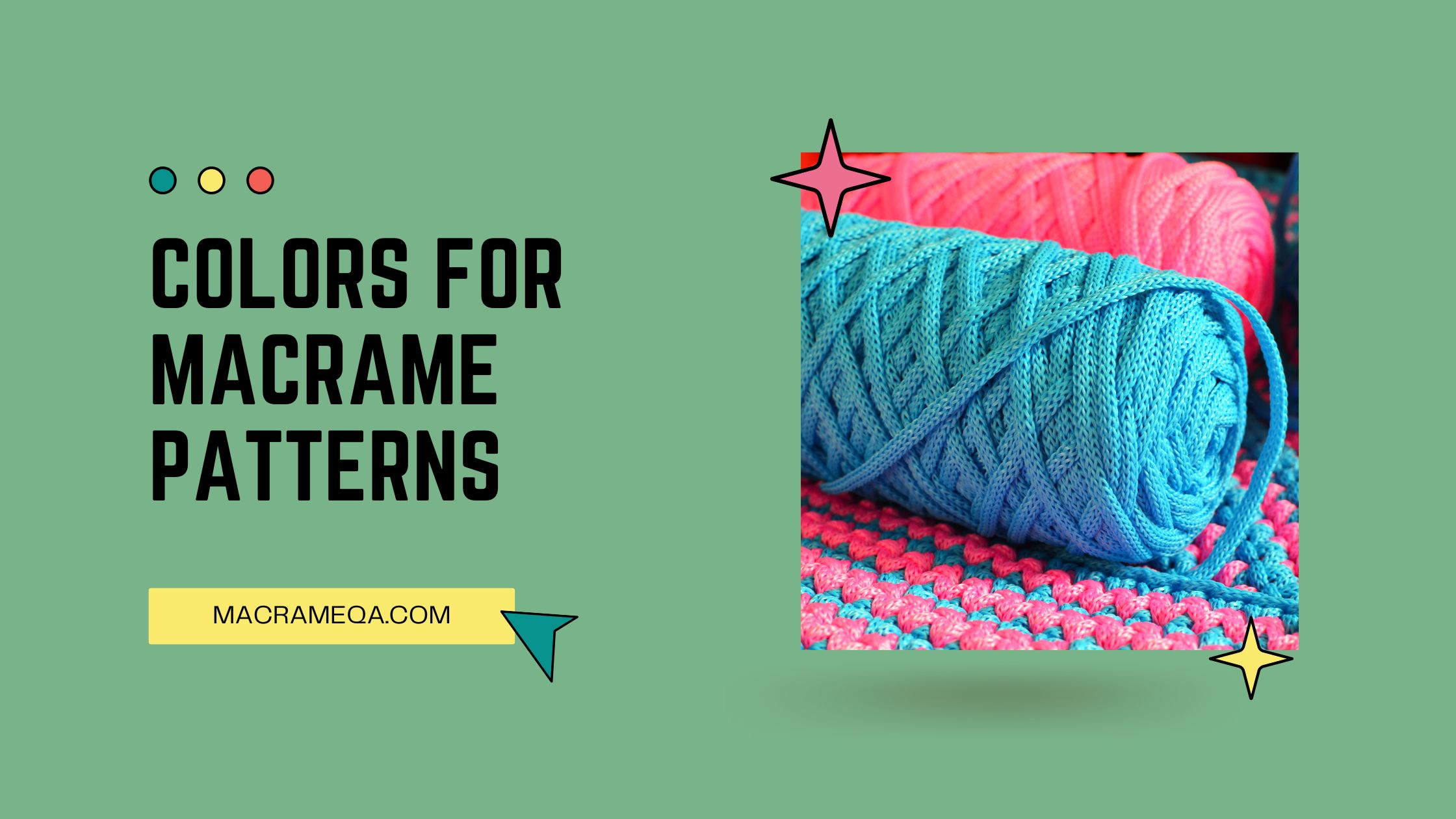
Secondary colors are created by mixing two primary colors together. The secondary colors on the color wheel are orange, green, and purple. Orange is created by mixing red and yellow, green is the result of blending blue and yellow, and purple is made by combining red and blue. Secondary colors are vibrant and add a lot of energy to a macrame project.
Tertiary Colors
Tertiary colors are created by mixing a primary color with a neighboring secondary color on the color wheel. These colors are more subdued and offer a wide range of options for macrame projects. For example, blending red and orange creates a reddish-orange color, which is a tertiary color.
Complementary Colors
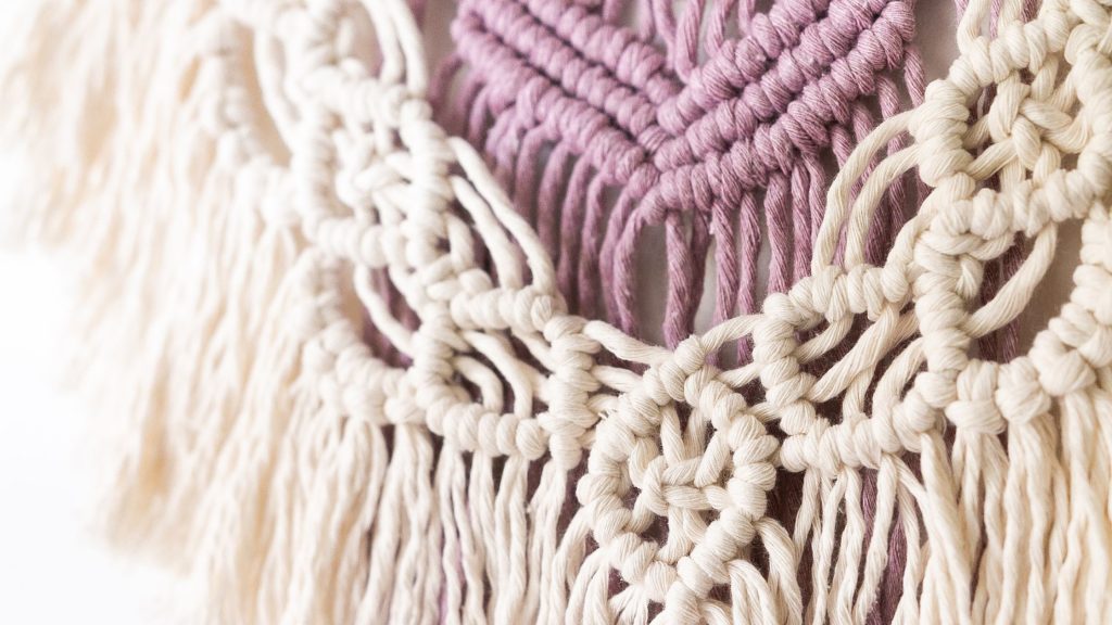
Complementary colors are opposite each other on the color wheel. When used together, they create a strong visual contrast that can make a macrame project stand out. For example, blue and orange are complementary colors.
Analogous Colors
Analogous colors are next to each other on the color wheel and have a harmonious effect when used together. They create a cohesive and pleasing look. For example, blue, blue-green, and green are analogous colors.
Triadic Colors
Triadic colors are evenly spaced around the color wheel. Using three colors that are equidistant from each other creates a vibrant and balanced look. For example, red, yellow, and blue are triadic colors.
Warm and Cool Colors
Warm colors are associated with energy and excitement, while cool colors are calming and soothing. Understanding the emotional impact of warm and cool colors can help in choosing the right colors for a macrame project. Warm colors include red, orange, and yellow, while cool colors include blue, green, and purple.
Considering the Macrame Project
Purpose and Theme
Before choosing colors for a macrame project, it’s important to consider the purpose and theme of the project. Is it a wall hanging, a plant hanger, or a decorative item? The purpose can influence the color choices and the overall design of the project. Additionally, consider the theme or style you want to convey. Is it bohemian, modern, or rustic? This will also help guide your color selection.
Intended Setting
Think about where the macrame project will be placed. Is it for an indoor space, such as a living room or bedroom, or an outdoor space, like a balcony or garden? The intended setting can impact the choice of colors. Indoor spaces may have different lighting conditions compared to outdoor spaces, and the surrounding decor can also influence color choices.
Size and Complexity
Consider the size and complexity of the macrame project. Larger projects may require more thought towards color combinations, as they have a greater visual impact. It’s also important to think about the intricacy of the design and how colors can enhance or detract from it. Complex patterns may benefit from a more limited color palette, while simpler designs may allow for more experimentations with color.
Personal Preferences
Ultimately, personal preferences play a significant role in color selection. Consider your own style and the colors that resonate with you. Macrame projects are often an expression of creativity and personal taste, so choose colors that bring joy and reflect your individuality.
Creating Harmony and Balance
Monochromatic Color Scheme
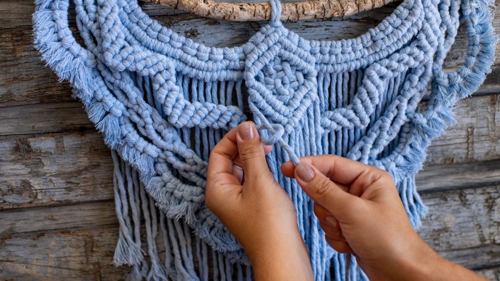
A monochromatic color scheme involves using shades and tints of a single color. This creates a harmonious and cohesive look while allowing for variation in lightness and darkness. For a macrame project, this can be achieved by selecting different tones of a primary or secondary color. A monochromatic color scheme is simple yet elegant.
Analogous Color Scheme
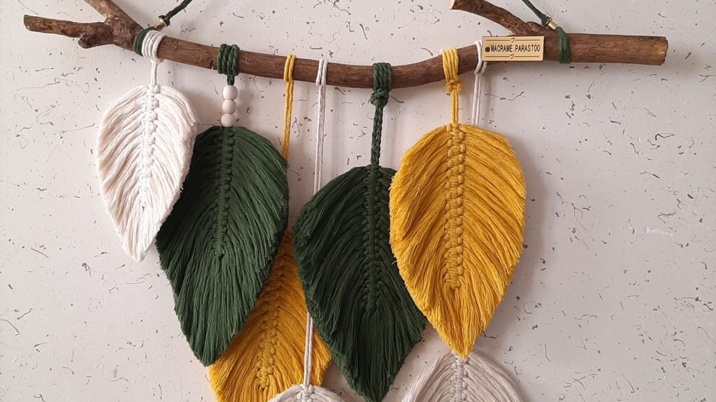
An analogous color scheme involves using colors that are next to each other on the color wheel. This creates a pleasing and balanced look. For example, using shades of blue, blue-green, and green together in a macrame project can create a soothing and natural feel.
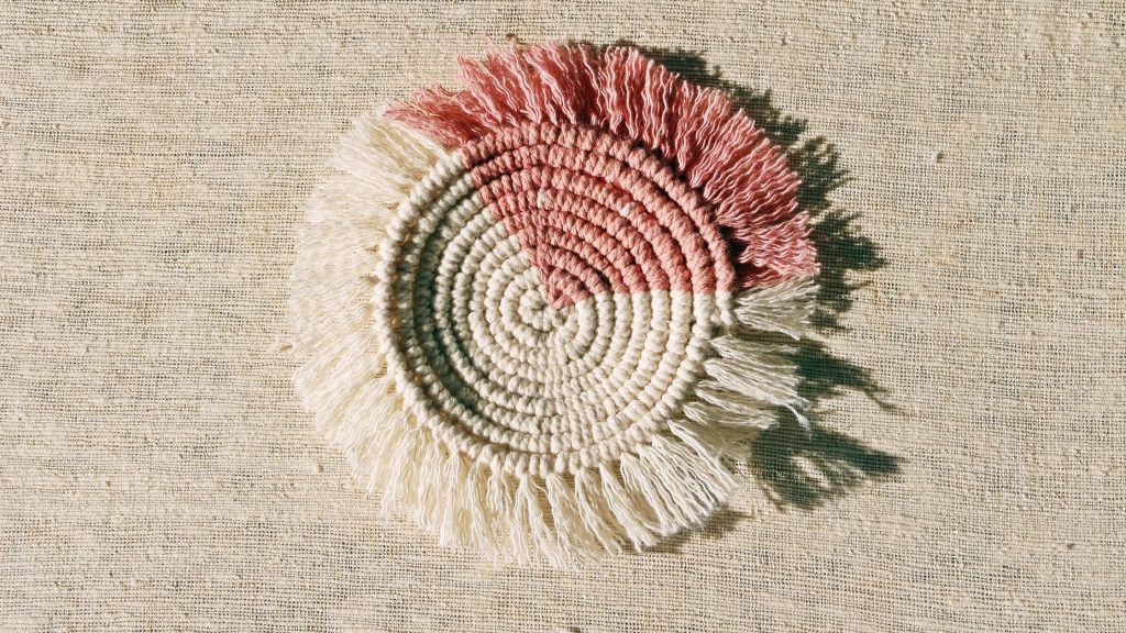
Complementary Color Scheme
A complementary color scheme involves using colors that are opposite each other on the color wheel. This creates a striking and bold visual contrast. Combining colors like blue and orange or red and green in a macrame project can make it visually appealing and eye-catching.
Split-Complementary Color Scheme
A split-complementary color scheme involves using a base color and the two colors adjacent to its complementary color. This allows for a combination of contrasting colors while maintaining a level of harmony. For example, if the base color is blue, the split-complementary colors could be yellow-orange and red-orange.
Triadic Color Scheme
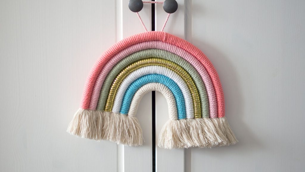
A triadic color scheme involves using three colors that are evenly spaced around the color wheel. This creates a vibrant and balanced look. For a macrame project, choosing colors like red, yellow, and blue can result in a visually striking and energetic design.
Tetradic Color Scheme
A tetradic color scheme involves using two sets of complementary colors. This allows for a wide range of colors and adds complexity to the macrame project. It’s important to find a balance within the color scheme to ensure harmony and coherence.
Neutral Color Scheme
A neutral color scheme involves using colors such as white, gray, black, beige, or brown. Neutrals can add sophistication and elegance to a macrame project. They also serve as a backdrop for bolder colors to stand out.
Working with Color Psychology
Understanding Color Associations
Colors have various associations and symbolism that can evoke different emotions and meanings. For example, blue is often associated with tranquility and reliability, while red is associated with passion and energy. Understanding these associations can help in creating a desired mood or atmosphere with the chosen colors in a macrame project.
Emotional Impact of Colors
Different colors can elicit specific emotions. Warm colors like red, orange, and yellow can evoke feelings of excitement and warmth. Cool colors like blue, green, and purple can have a calming and relaxing effect. By understanding the emotional impact of colors, you can select colors that align with the intended mood or atmosphere of the macrame project.
Using Colors to Create Mood
Colors can greatly influence the mood of a space. Bright and vibrant colors can create a cheerful and energetic atmosphere, while muted and earthy tones can evoke a sense of calm and tranquility. Consider the desired mood for the macrame project and choose colors that align with that mood.
Considering Cultural Meanings
Colors can also have cultural meanings and associations. It’s important to consider these when choosing colors for a macrame project, especially if it is intended to be displayed in a specific cultural context. For example, white may symbolize purity and new beginnings in some cultures, while it may be associated with mourning in others. Researching cultural meanings can help avoid unintentional misinterpretations.
Color Selection Techniques
Color Samples and Swatches
One of the simplest ways to choose colors for a macrame project is by using color samples and swatches. Visit a local craft store or use online resources to gather a variety of colors. Arrange the samples together and see how they look as a group. This allows you to visually compare and contrast different color combinations.
Color Theory Apps and Websites
Color theory apps and websites provide a wealth of resources for color selection. These tools often offer color palettes, color combination suggestions, and even the ability to upload photos and extract colors from them. Explore different color theory apps and websites to find ones that resonate with your style and project.
Color Inspiration from Nature
Nature is a great source of color inspiration. Take a walk outside and observe the colors of flowers, trees, and landscapes. Notice how different colors coexist harmoniously in nature and consider incorporating those color palettes into your macrame project. Drawing inspiration from nature can create a sense of connection to the natural world.
Drawing Inspiration from Art
Art, whether it’s paintings, sculptures, or photographs, can spark creativity and help in color selection. Explore different art styles and find works of art that inspire you. Pay attention to how color is used in those artworks and consider applying similar color combinations to your macrame project.
Considering Color Trends
Color trends can provide guidance and inspiration when choosing colors. Keep up with current trends in home decor, fashion, and design to see what colors are popular. While trends can change quickly, incorporating elements of current color trends can give your macrame project a contemporary and fashionable look.
Contrasting and Accenting Colors
Using Light and Dark Shades
Contrasting light and dark shades of a color can add depth and dimension to a macrame project. Lighter shades can create a sense of openness and brightness, while darker shades can add richness and drama. Experiment with different shades to find a balance that enhances the overall design.
Incorporating Bright and Bold Colors
Bright and bold colors can make a macrame project visually striking and attention-grabbing. These colors can add a pop of vibrancy and liveliness to the piece. Consider incorporating bright and bold colors as accents or focal points to create visual interest.
Adding Neutrals as Contrast
Neutrals, such as white, gray, or beige, can provide contrast to bolder colors. They can help balance out the color palette and prevent overwhelming the eye. Consider using neutrals as a backdrop or as accents to create a sense of balance and harmony.
Choosing Colors with Texture in Mind
Consider the texture of the macrame materials when selecting colors. Different colors can emphasize or downplay the texture of the knots and fibers. Lighter colors can highlight the intricacies of the macrame, while darker colors can create a more subtle and textured look.
Utilizing Metallic and Reflective Elements
Incorporating metallic or reflective elements into a macrame project can add a touch of glamour and sophistication. Metallic colors, such as gold or silver, can create a luxurious feel. Reflective elements, like mirrors or glass beads, can add sparkle and catch the light. Using metallic and reflective colors strategically can elevate the overall visual impact of the macrame piece.
Considering Color Materials
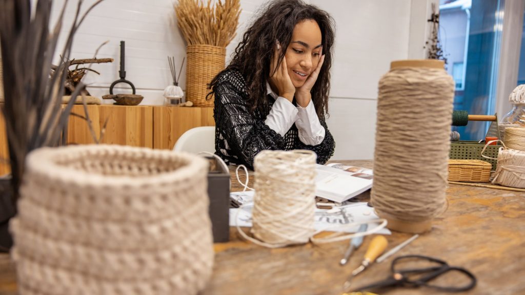
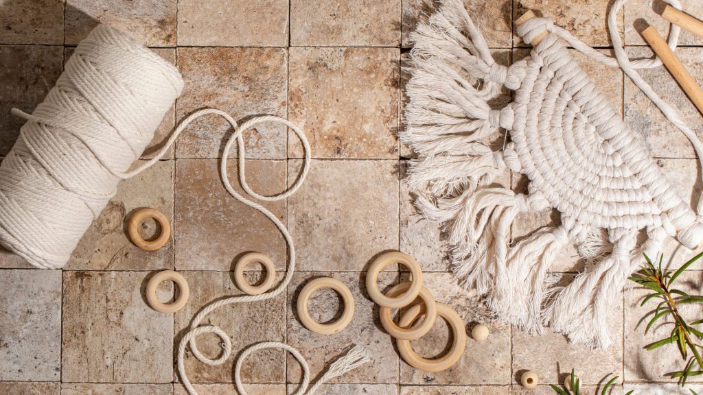
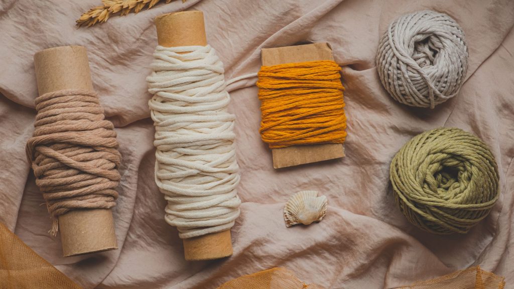
Cotton Yarn
Cotton yarn is a popular choice for macrame projects. It is versatile, easy to work with, and comes in a wide range of colors. Cotton is known for its softness and natural appeal. It can be dyed in vibrant colors, making it suitable for both bold and subtle macrame designs.
Jute/Twine
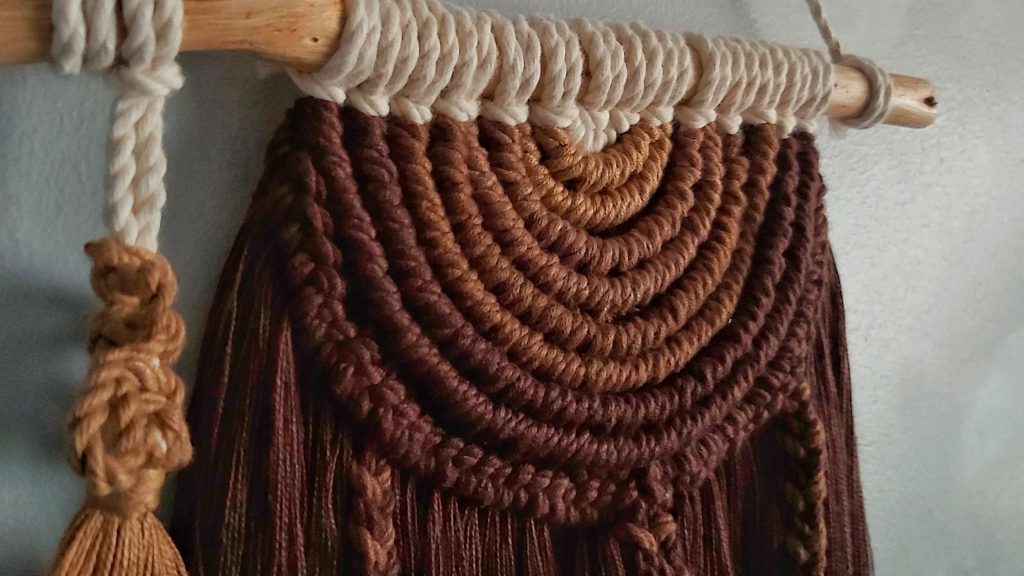
Jute or twine is a durable and natural-looking material that adds a rustic touch to macrame projects. It has a slightly rough texture and is often available in earthy tones like brown, beige, and green. Jute can add depth and warmth to a macrame piece, especially when paired with other natural materials.
Satin or Silk Cord
Satin or silk cord is a luxurious option for macrame projects. It has a smooth and shiny texture that adds elegance and sophistication. Satin and silk cords come in a wide range of colors, including pastels and vibrant hues. They are suitable for creating macrame pieces with a delicate and refined look.
Nylon or Polyester Cord
Nylon or polyester cord is a durable and versatile option for macrame projects. It is available in various thicknesses and colors, making it suitable for projects of different sizes and styles. Nylon and polyester cords are often used for macrame plant hangers or outdoor pieces due to their weather-resistant properties.
Natural Fibers (Wool, Hemp, etc.)
Natural fibers like wool, hemp, and other plant-based materials offer unique textures and colors for macrame projects. These fibers can add depth, warmth, and a tactile dimension to the piece. Natural fibers are often available in earthy tones, which can complement a nature-inspired or bohemian-themed macrame project.
Testing Color Combinations
Creating Small Color Swatches
When trying out color combinations for a macrame project, create small swatches using the chosen colors. This allows you to see how the colors interact and if they create the desired visual effect. Play around with different arrangements and combinations to find what works best for your project.
Making Mock-ups or Sketches
Mock-ups or sketches can help visualize how the chosen colors will look in the final macrame project. Use paper or a digital drawing tool to create a rough representation of the design. Fill in the colors and evaluate the overall composition. This step can help refine the color choices and make any necessary adjustments.
Experimenting with Digital Tools
Digital tools can be helpful in experimenting with color combinations. There are various online platforms and software that allow you to digitally apply colors to a design. Upload an image or create a virtual macrame project and try out different color combinations. This can save time and give a realistic preview of the final result.
Seeking Feedback and Opinions
Getting feedback and opinions from others can provide valuable insights into color combinations. Share your ideas and swatches with friends, family, or fellow macrame enthusiasts. They can offer different perspectives and suggest color combinations that you may not have considered. Ultimately, trust your own instinct and make choices that resonate with you.
Exploring Trends and Personal Style
Keeping Up with Macrame Trends
Macrame trends are constantly evolving, and staying up to date can provide inspiration and guidance in color selection. Follow macrame artists, browse social media platforms, and explore macrame-focused websites for the latest trends in colors, patterns, and styles. Incorporating elements of current macrame trends can give your project a fresh and trendy look.
Finding Inspiration in Different Styles
Explore different macrame styles and find inspiration from various sources. Whether it’s bohemian, minimalist, coastal, or eclectic, each style offers unique color palettes and combinations. Look for macrame projects or interior design inspirations that align with your personal style. Drawing from different styles can help create a macrame piece that reflects your individual taste.
Infusing Personal Touches
Personal touches are what make a macrame project truly yours. Incorporate colors that have personal significance or resonate with your memories and experiences. This can add a meaningful and sentimental touch to the project. Experiment with color combinations that reflect your personality and create a macrame piece that feels authentic and special to you.
Considering Timelessness
While trends can be exciting to follow, it’s also important to consider the timelessness of your macrame project. Opting for classic and neutral colors, such as whites, grays, or earth tones, can ensure that your piece remains visually appealing and relevant for years to come. Balance trendy elements with timeless colors to create a macrame project with longevity.
Adapting to Different Color Environments
Choosing Colors for Indoor Spaces
Consider the lighting and existing decor of the indoor space when choosing colors for a macrame project. Natural lighting can affect how colors appear, so take into account the brightness and hue of the room. Evaluate the color palette of the surrounding decor and aim for colors that complement or contrast harmoniously with the space.
Considering Natural Lighting
For macrame projects intended for outdoor spaces or areas with abundant natural light, it’s important to consider how the colors will be influenced by the sunlight. Bright and vibrant colors can appear even more vivid under natural lighting, while pastels and muted tones may complement the softness of natural light. Think about how the colors will interact with the environment.
Adapting to Artificial Lighting
Artificial lighting can drastically change the way colors appear. Consider the type of artificial lighting in the space where the macrame project will be displayed. Different lighting options, such as warm or cool LED bulbs, can alter the hue and intensity of colors. Test out the chosen colors under artificial lighting to ensure they still create the desired effect.
Considering Outdoor and Natural Settings
If the macrame project will be placed in an outdoor or natural setting, consider the colors that are already present in nature. Colors that complement the surroundings, like earthy tones or shades found in foliage, can create a harmonious and seamless integration with the environment. By considering the natural setting, the macrame project can blend beautifully into its surroundings.
Conclusion
In conclusion, choosing colors for your macrame patterns requires careful consideration of the color wheel, the purpose and theme of the project, and personal preferences. By understanding color harmonies, exploring color psychology, and considering different color materials and environments, you can create stunning and visually appealing macrame projects that reflect your style and meet your creative vision. Experiment with different color combinations, seek inspiration from various sources, and make choices that bring joy and create a harmonious balance in your macrame designs.